Tickled Pink, Blue and Greenery
By Wimberly Interiors
February 7, 2017
Wimberly Interiors Designers Share their 2017 Spring / Summer Design Trends
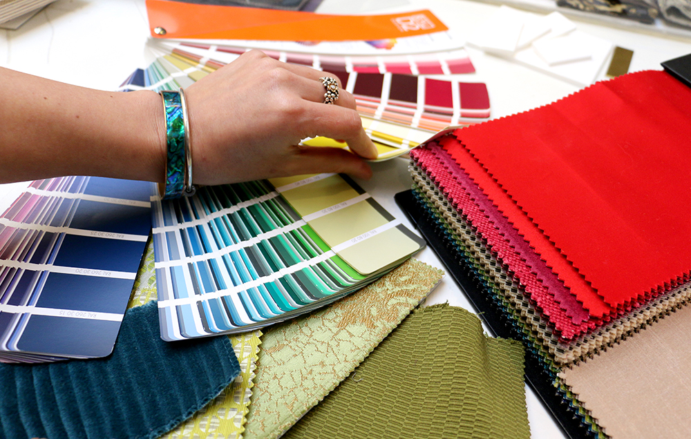
With the first hints of sunshine on the horizon, Wimberly Interiors’ designers in London and New York talk through some of the hot colour and fabric trends we’re going to see emerging for Spring / Summer 2017. While we’re all embracing fresh greens, we’re also predicting a whole new level of luxe and opulence, punctuated by dark, jewelled tones and lavish textures and patterns.
Wimberly Interiors top colour trends of 2017:
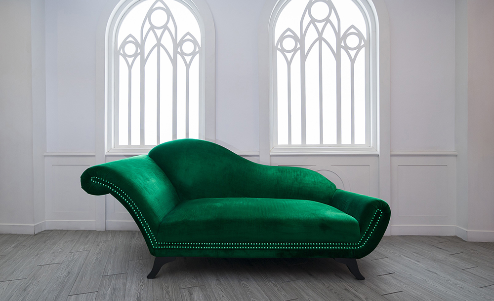
Green is the new black Naturally after the announcement of ‘Greenery’ as Pantone’s Colour of the Year, splashes of vibrant green will be dictating this season’s design agenda, and at Wimberly Interiors, we are welcoming it with open arms. Greenery is the perfect, bright diversion to the winter chill that has firmly set in across the Northern hemisphere.
“In 2016, we began to see people dressing their interiors with greenery, set against minimalist white walls and the palm print trend taking off. This year we can expect to see green going even further, from painted green walls to fabrics and the use of plants wherever possible, from shrubbery to huge indoor trees. The look is fresh and zesty to mirror the consumer’s interest in health, youth and wellbeing.”- Sophie Deeley, Project Designer, Wimberly Interiors London
And as we enter Year of The Rooster, the colour green also shines bright from a Feng Shui perspective, symbolic of health and abundance. A primary colour in nature, green relates to the Wood Element in Feng Shui and the aspiration of prosperity, good fortune and healing.
“Using the colour green in design schemes and installations for the home or office benefits our physical and mental well-being. Use the colour to renew, rejuvenate and refresh a space, to give you emotional support and attract new opportunities. You can also use green as an accent in your design scheme such as painting out a front door, the home’s Mouth of Chi, to encourage the positive energy to flow in and manifest your desires.” – Christine A. Bushell, CFSP, SynerChi Feng Shui Consulting
“Use the colour to renew, rejuvenate and refresh a space, to give you emotional support and attract new opportunities.”
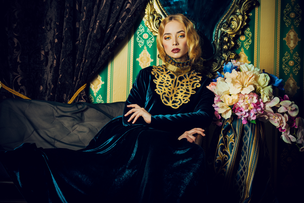
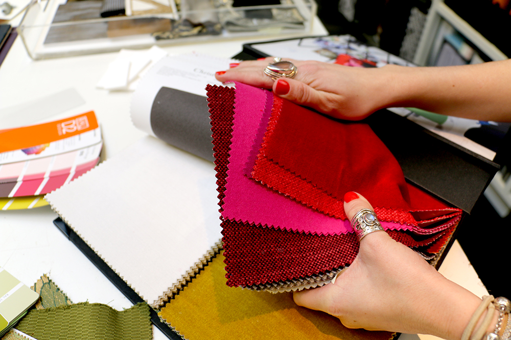
Classic Opulence Clean simplicity and minimalism have dominated the design scene for several seasons but this year, designers will be experimenting more with rich and luxurious tones to achieve a truly classic and lasting look.
“Everyone will want to add character and depth to their interiors this year. This can be created by using rich colours and textures such as velvet. No longer exclusive to just accents, velvet will be used everywhere from chairs to curtains.” – Sophie Deeley, Project Designer, Wimberly Interiors London
Renaissance Florals Florals have long been a favourite for Spring / Summer but this season the trend will evolve to encompass more dramatic tones, giving it a renaissance feel.
“The trend has spread from the fashion world into interiors. Catwalks adorned with flamboyant floral patterns will filter into our homes and we’ll see yellow and green take over to enhance bold schemes.” – Rita M. Menendez Paz De Tagle, Associate + Senior Designer, Wimberly Interiors London
“Everyone will want to add character and depth to their interiors this year. This can be created by using rich colours and textures such as velvet.”
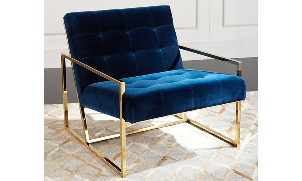
The New Blue Bright blues will take a backseat for 2017, making way for moodier and subtler atmospheric hues.
“While green might be every designer’s shade of choice this year, blues are also going to reign supreme in residential and luxury hospitality environments. All shades are turning earthier and we expect to be using delicate, muted blues over vibrant tones.” – Sophie Deeley, Project Designer, Wimberly Interiors, London
Monochromatic versus Vibrancy In the past monochromatic and vibrant schemes have often been kept strictly separate but this year the ultimate design dream will combine the two.
“We believe that the most beneficial aspect of monochromatic schemes is the feeling of timeless design that still translate years after its original design. The benefits of a vibrant mix of colours makes for a more exciting sensory experience and challenges the designer to create a curated palette. Ideally a great design will start with a monochromatic base and layer in vibrant colours to make for a perfect marriage of colours and textures.’ – Anisah Ahmed, Designer, Wimberly Interiors New York
Latest Insights
Perspectives, trends, news.
- Strategy & Research |
- Design Thinking & Innovation
Hotel Wuxi MGallery Collection: Part of a Story

- Strategy & Research |
- Design Thinking & Innovation
Hotel Wuxi MGallery Collection: Part of a Story
- News
Behind The Scenes: ‘We Create Moments’

- News
Behind The Scenes: ‘We Create Moments’

- News
Hotel Room 404: The Mystery of the Missing Floor

- News
Hotel Room 404: The Mystery of the Missing Floor

- Employee Feature
Thirty Years of Change, One Constant Vision: A Conversation with Howard Wolff

- Employee Feature