Design Discourse: 5 Words of Inspiration
At a glance
Design Discourse: 5 Words of Inspiration presents the five words that anchor Paolo’s approach to interior design. The piece profiles De Simone’s nearly two-decade career across hospitality, retail, food and beverage, and residential projects in Europe, Africa, and Asia, noting his WELL AP accreditation and his focus on integrating nature into interior environments to support wellbeing and stress recovery. Recent projects referenced include luxury residential developments at Palm Jebel Ali Island, a 55-key Banyan Tree resort in the Philippines, and the MGallery hotel in a heritage town in China.
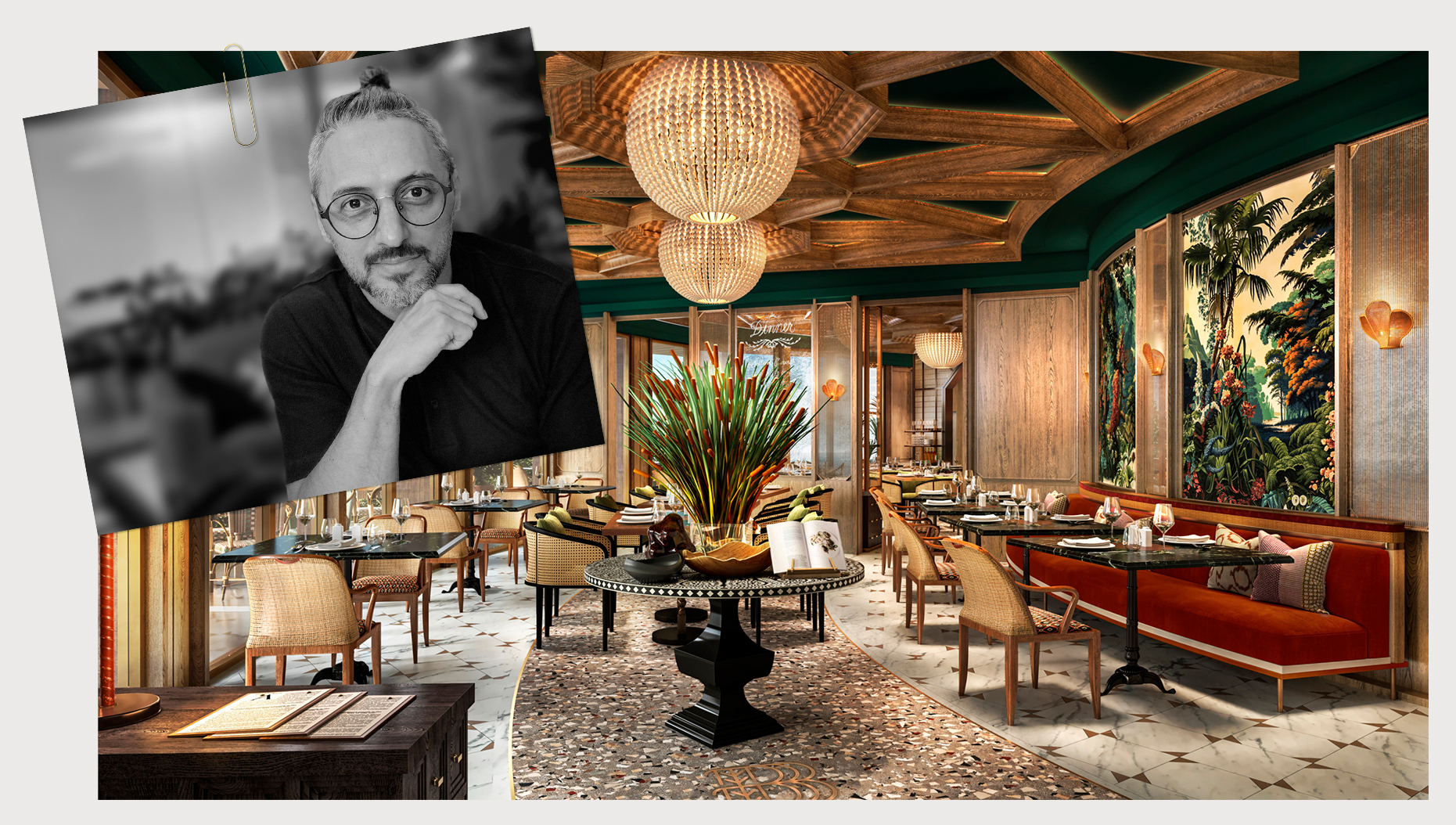
With an educational background in architecture as well as interior design, Paolo De Simone, Creative Director of Wimberly Interiors Singapore, has amassed nearly two decades of expertise in crafting captivating and opulent interiors for luxury hotel brands and resorts working on projects throughout Europe, Africa, and Asia. His knowledge and proficiency encompass a diverse range of project types including hospitality, retail, food and beverage and residential. His most recent portfolio includes a set of high-end luxury residential developments in Palm Jebel Ali Island, Taiwan, Colombo, the 55-keys Banyan Tree Resort in the Philippines and M Gallery Hotel within a unique and historical landmark in China.
Being WELL AP accredited, Paolo demonstrates his commitment to advancing health and wellness through his designs. He believes that well-being is all about making connections on various levels through mindful choices to incorporate nature in interior spaces and the built environment, and strives to nurture the innate human-nature interaction through his design solutions that boost positive feelings, speed up healing and recovery time from stress.
Fueled by an unyielding passion for crafting immersive experiences, Paolo’s approach aims to redefine modern luxury, seamlessly transforming spaces into inspiring environments that captivate the senses. We found some time to chat with him to explore his interior inspiration in 5 words.
If I were to draw inspiration from a place, it would be the timeless city of Florence, Italy where I studied and graduated in Architecture. Its rich history, architectural marvels, and the effortless fusion of classical and contemporary elements have always stimulated my creativity. Just walking around the city and studying the buildings enable me to build my unique design approach that embodies a timeless fusion of art, nature, and architecture.
The essence of the city, informed by symmetry, formal layouts, architectural elements, water features, sculptural accents, and curated landscape, convinced me that there is something to be celebrated – behind all the beauty of the natural world, therein lies the harmonious union with human creativity and ingenuity with spaces that tell these deeply moving stories.
I emphasize the tactile sensation in a space, where the textures of materials and the coziness of furnishings are key to creating an engaging environment. My goal is to design visually appealing spaces that invite profound sensory interaction, encouraging individuals to touch, explore, and connect with their surroundings for a richer experience. When selecting materials or finishes, I carefully consider their aesthetic and tactile qualities, from the smoothness of marble to the warmth of wood and the softness of fabrics. Each element is chosen to enhance the sensory experience, considering how materials interact with light and age, ensuring durability and lasting beauty. This meticulous attention to detail ensures that every surface and texture harmoniously enhances the overall ambiance, making the space both beautiful and tactile.
Army green, with its rugged charm and understated elegance, holds a special place in my personal spectrum of colors. It’s not just a hue; it’s a statement, a reflection of resilience, and a symbol of strength. For me, army green isn’t just a favorite color; it’s a palette of shades that resonates with me deeply, each representing a different facet of life and emotion. At first glance, army green exudes a sense of calm and tranquility, reminiscent of the lush foliage of a dense forest, embodying nature’s harmony, evoking feelings of peace and serenity. I like that the color can be incorporated into the interiors in a multitude of ways, from a quieter and more neutral approach to a more vibrant and dramatic stance. It’s a color that resonates with me on a profound level, reminding me of the beauty and resilience that can be found in every shade of life.
If I had to distill my design philosophy into a single word, it would be “Harmony.” For nearly two decades, my journey in design has been a quest to find that delicate balance where aesthetics, functionality, and emotions harmonize seamlessly. It’s the guiding principle that ensures each project is an orchestration of elements working together in perfect unison. Many people mistakenly believe that creating harmony means matching everything perfectly. However, this can lead to a dull and monotonous space. True harmony involves achieving a balance between elements while allowing for diversity and contrast. Some designers and homeowners focus too much on matching every element in a room, from furniture to decor. While coordination is important, an overly matched space can lack visual interest and personality. Mixing different styles, textures, and colors can enhance harmony by adding depth and richness to the design.
Among the array of items adorning my house, there’s one unsung hero that steals the show—the catch-all tray! It’s not just any tray; it’s a miniature marvel that reigns supreme in its ability to corral the chaos of my daily life. Overflowing with odds and ends like keys, spare change, and mysterious trinkets, this unassuming tray serves as a makeshift museum of memories. From the remnants of failed DIY projects to cryptic sticky notes scribbled in a moment of midnight madness when inspiration hits, each item tells a tale—some more humorous than others. Despite its humble origins, the catch-all tray boasts an air of sophistication, whether it’s crafted from faux marble or recycled materials. Its presence adds a touch of whimsy to my decor, proving that practicality and charm can indeed coexist. In a world inundated with flashy gadgets and trendy knick-knacks, the catch-all tray stands out as my unexpected favorite—a reliable companion in the unpredictable day of life.
About The Author

Paolo De Simone
Paolo brings over 16 years of architecture and interior design experience to Wimberly Interiors. Working on projects throughout Europe, Africa and Asia, he has a passion for experiencing new places and being inspired by the cultural and historic aspects that make each one unique.
Latest Insights
Perspectives, trends, news.
- News
WATG and Wimberly Interiors in the Global Press: July 2026

- Strategy + Research
Beyond Growth: Designing What’s Next for the Sunbelt

- Project Stories
Thanh Xuan Valley: Why BIM Land and WATG Let the Landscape Lead

- Design + Innovation